booking categories

An illustrative sketch of a flower

overview

In the order management system, there was a shortcoming in the previous flow that oftentimes led users to a frustrating end state that required additional work. I worked with a major publisher to rework this flow to not only make the process more efficient, but also add new functionality into the system itself.

​

Role: lead designer

Timeline: six months

Team: one product manager, three developers, one other designer

Tools: Figma

problem

The original workflow for users to book products within the OMS required them to front-load many parameters and select products prior to knowing how many impressions would be available from the ad server. This would lead to frustration by having to modify parameters – dates, key values, ad units, targeting, etc. – multiple times in order to find a forecast and availability that met the advertiser’s requirements. This was a major bottleneck in employee efficiency as well as the main area of feedback for user frustration.

goals and constraints

Improve the flow by checking availability before selecting any products. This included moving targeting parameters up to the first step of the process and allowing users to bulk check availability before making any selections.

​

Improve product catalog navigation with enhanced search and the ability to ‘bucket’ similar products together to shrink down the catalog when viewing, but keep the flexibility to “view all” if desired.

​

Rethink the entire process while keeping note of client processes and how much data they would like to see onscreen at a given time.

users and research

This project was driven almost exclusively by a single client, but we did take the time to discuss potential changes with other important partners to avoid tailoring these changes too specifically. In our testing with the partner client and others, we used Maze in order to get feedback on the basic flow to ensure it made sense and did not slow them down. The partner client was very open to hearing feedback from other clients and would often work with us in to find a solution that fit their needs but did not exclude others from using this functionality. This was not the most standard research process, but it was thorough since there were multiple months of meetings to gather requirements and discuss flows before any development work was started.

key decisions

Create new configurable UI for custom and targeting fields. A major part of this project was presenting users with a UI that allowed them to filter on their own custom fields, as well as add ad server targeting to their inventory queries upfront. I created a view that allowed for them to toggle between different product categories, each that could have their own set of fields to manipulate and target even further.

​

New, more interactive product catalog. The original product catalog was simply a list that displayed client products in list or folder view. For the new version, I included a more robust search mechanism, as well as added configurable columns that would display Availability, Default Price, and Budget (the total that could be earned for a product based on price and availability) within the control. I later added visual cues related to specific ad server targeting, giving users a full view of inventory details before making a single selection for booking.

​

Brand new shopping cart. There was no cart in the system before. Users selected products, hit create, and then dealt the details afterward. I created a more modern looking cart that gave users more space to work with via horizontal scroll, and which allowed for interactivity such as re-checking availability or modifying targeting for a given line right there. This gave the user much more functionality before finalizing their selections for booking.

solution

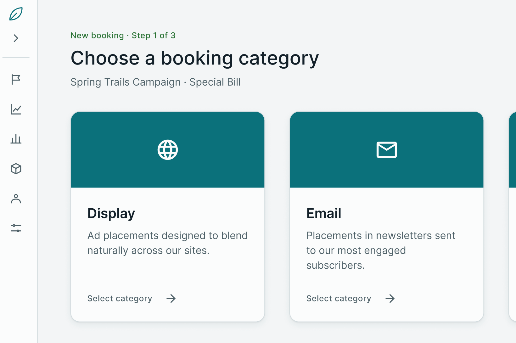
Working with the product team, I came up with all-new screens for this process. A major change was a card-focused first step that a user could use to filter the product tree from the start, or which they could skip to see all products and then filter. Alongside that change, there was a new selection screen with configurable fields and targeting sitting alongside an enhanced and rebuilt product catalog. This addition removed the need to complete a major step at the very end of the process. Finally, a new shopping cart experience that provided more information onscreen before saving and still allowed for targeting modification rounded out the updates.

outcome

The booking process, which was opt-in for clients, was an all-new UI/UX from step one, all the way through the save process. Altogether, it rearranged the flow for users that has been place since the OMS’s inception. It made it easier to choose products and know what can be booked early in the process and cut down on users needing to repeatedly tweak details on booked lines. Adoption for the new flow hit ~50% of clients within the first year of its release. That might not sound like much, but the publisher space is very slow to modify their processes since it is already so involved. The “trying to turn an ocean liner” is a very apt analogy for this space.

reflection

While I would still work very closely with the partner client in these situations, I would do more testing to get feedback from other clients. 50% adoption is good, but I know that there are clients out there who would benefit from this that did not necessarily see the value in changing because they already had their internal processes set. I would like to have been able to find more angles to work in order to get them to enable the flow sooner. I would also push more to make bigger UI changes to this brand-new flow. To save dev time, a lot of the components on these new pages, aside from the cards, were re-used components for other screens. I get that it results in consistency, but I also do not know if those components were the best for this all-new UI that was being touted as the future. I would have liked us to push the envelope more, because I believe that would have pushed adoption more as well.

booking categories

An illustrative sketch of a flower

overview

In the order management system, there was a shortcoming in the previous flow that oftentimes led users to a frustrating end state that required additional work. I worked with a major publisher to rework this flow to not only make the process more efficient, but also add new functionality into the system itself.

​

Role: lead designer

Timeline: six months

Team: one product manager, three developers, one other designer

Tools: Figma

problem

The original workflow for users to book products within the OMS required them to front-load many parameters and select products prior to knowing how many impressions would be available from the ad server. This would lead to frustration by having to modify parameters – dates, key values, ad units, targeting, etc. – multiple times in order to find a forecast and availability that met the advertiser’s requirements. This was a major bottleneck in employee efficiency as well as the main area of feedback for user frustration.

goals and constraints

Improve the flow by checking availability before selecting any products. This included moving targeting parameters up to the first step of the process and allowing users to bulk check availability before making any selections.

​

Improve product catalog navigation with enhanced search and the ability to ‘bucket’ similar products together to shrink down the catalog when viewing, but keep the flexibility to “view all” if desired.

​

Rethink the entire process while keeping note of client processes and how much data they would like to see onscreen at a given time.

users and research

This project was driven almost exclusively by a single client, but we did take the time to discuss potential changes with other important partners to avoid tailoring these changes too specifically. In our testing with the partner client and others, we used Maze in order to get feedback on the basic flow to ensure it made sense and did not slow them down. The partner client was very open to hearing feedback from other clients and would often work with us in to find a solution that fit their needs but did not exclude others from using this functionality. This was not the most standard research process, but it was thorough since there were multiple months of meetings to gather requirements and discuss flows before any development work was started.

key decisions

Create new configurable UI for custom and targeting fields. A major part of this project was presenting users with a UI that allowed them to filter on their own custom fields, as well as add ad server targeting to their inventory queries upfront. I created a view that allowed for them to toggle between different product categories, each that could have their own set of fields to manipulate and target even further.

​

New, more interactive product catalog. The original product catalog was simply a list that displayed client products in list or folder view. For the new version, I included a more robust search mechanism, as well as added configurable columns that would display Availability, Default Price, and Budget (the total that could be earned for a product based on price and availability) within the control. I later added visual cues related to specific ad server targeting, giving users a full view of inventory details before making a single selection for booking.

​

Brand new shopping cart. There was no cart in the system before. Users selected products, hit create, and then dealt the details afterward. I created a more modern looking cart that gave users more space to work with via horizontal scroll, and which allowed for interactivity such as re-checking availability or modifying targeting for a given line right there. This gave the user much more functionality before finalizing their selections for booking.

solution

Working with the product team, I came up with all-new screens for this process. A major change was a card-focused first step that a user could use to filter the product tree from the start, or which they could skip to see all products and then filter. Alongside that change, there was a new selection screen with configurable fields and targeting sitting alongside an enhanced and rebuilt product catalog. This addition removed the need to complete a major step at the very end of the process. Finally, a new shopping cart experience that provided more information onscreen before saving and still allowed for targeting modification rounded out the updates.

outcome

The booking process, which was opt-in for clients, was an all-new UI/UX from step one, all the way through the save process. Altogether, it rearranged the flow for users that has been place since the OMS’s inception. It made it easier to choose products and know what can be booked early in the process and cut down on users needing to repeatedly tweak details on booked lines. Adoption for the new flow hit ~50% of clients within the first year of its release. That might not sound like much, but the publisher space is very slow to modify their processes since it is already so involved. The “trying to turn an ocean liner” is a very apt analogy for this space.

reflection

While I would still work very closely with the partner client in these situations, I would do more testing to get feedback from other clients. 50% adoption is good, but I know that there are clients out there who would benefit from this that did not necessarily see the value in changing because they already had their internal processes set. I would like to have been able to find more angles to work in order to get them to enable the flow sooner. I would also push more to make bigger UI changes to this brand-new flow. To save dev time, a lot of the components on these new pages, aside from the cards, were re-used components for other screens. I get that it results in consistency, but I also do not know if those components were the best for this all-new UI that was being touted as the future. I would have liked us to push the envelope more, because I believe that would have pushed adoption more as well.